Panel in Comics: Types, Techniques & Design Guide (2026)
Every comic you’ve ever read tells its story one panel at a time. A panel in comics is a window to the story—an individual frame containing a single moment or scene, and the fundamental building block of sequential art storytelling. Panels vary in size, shape, and arrangement, and work alongside gutters (the spaces between them) to control pacing, guide the reader’s eye, and create meaning through sequence. Understanding how panels work changes both how you create comics and how you read them.
As someone who writes and draws every page of my work—from script through inking—panel design is where the larger creative process begins. Long before my pencil touches paper, I plan the panels that will give a comic its visual rhythm and coherence. What follows is what I’ve learned about panels: what they do, how they connect, and why their design matters more than anything else in the comics creation process.

How Do Panels in Comics Create Visual Language?
Panels in comics function as the grammar of a visual language unique to the medium. They organize images into sequences that create narrative meaning—working with gutters, speech bubbles, captions, and illustrations to produce a reading experience no other art form can replicate.
Unlike prose, which moves word to word, comics guide readers through a strategic arrangement of frames that control emphasis, pacing, and narrative flow. Each panel represents a deliberate choice about what to show and—just as importantly—what to leave out.
The roots of this visual grammar run deep. The Bayeux Tapestry used sequential images to tell its story in the 11th century. Richard Outcault’s Yellow Kid panels helped define the American newspaper comic in the 1890s. By the 1960s, Jack Kirby had exploded the form—diagonal borders, double-page splashes, panels that vibrated with kinetic energy. Each generation expanded what panels could do.
As a philosophy comics creator, I find panels offer something no other medium can: the ability to frame abstract ideas and make them visible. A philosophical concept contained within a panel becomes tangible—an argument turned into image.

What Makes Comic Panel Design So Powerful?
Panel design controls how readers experience time, emotion, and meaning in comics. The size, shape, and arrangement of panels dictate pacing—small panels accelerate action, large panels force the reader to pause—creating a manipulation of time through space that is unique to sequential art.
A sequence of narrow panels can build tension like a ticking clock. A wide panel slows the narrative and gives the reader room to breathe. This control over temporal experience is something neither prose nor film can achieve in quite the same way—in comics, the reader sees the whole page at once yet reads it sequentially, holding both overview and moment simultaneously.
The relationship between panels and gutters creates what Scott McCloud calls “closure”—the mental process where readers fill in what happens between frames to form a continuous narrative. The panel frames a specific moment; the gutter invites the reader to participate in creating meaning. This collaboration between creator and reader is the engine of comics—the Hergé panels closing this article show exactly how closure works in practice.
Panel choices aren’t decorative—they’re storytelling tools that operate on both conscious and subconscious levels. A tilted panel creates unease. A borderless panel suggests limitless space. An inset panel pulls attention toward a critical detail.
In The Labyrinth, I built most pages on a grid of square panels—a steady rhythm that readers absorb as normality. Breaking that grid carries meaning. Vertical panels stretching down the page convey the weight of existential dread. Horizontal panels open up to suggest escape, the expansiveness of radical freedom. Full-page splashes isolate a character in vastness—the visual equivalent of being existentially abandoned, lost in a world without guideposts. The technical craft of paneling became inseparable from the philosophical content.
How Panels Connect: Transitions and Meaning Between Panels in Comics
The meaning of a comic doesn’t live inside individual panels—it emerges from the spaces between them. How one panel relates to the next—and how it sits among all the other panels on the page—determines whether a sequence reads as natural storytelling, poetic meditation, or a deliberate collision of ideas.
Panel-to-Panel Transitions
Scott McCloud identified six types of panel-to-panel transitions that remain the most widely referenced framework for understanding how adjacent panels relate:
–Moment-to-moment: Micro-steps within a single action. Time barely advances.
–Action-to-action: A subject progresses through distinct stages—a punch thrown, an opponent hitting the ground.
–Subject-to-subject: The viewpoint shifts between subjects within one scene.
–Scene-to-scene: A jump across significant time or space—leaving a dim office to arrive at a sunlit rooftop the next morning.
–Aspect-to-aspect: Different facets of a single moment or mood—a rainy window, an untouched cup of tea, a clock. No time passes, but atmosphere builds.
–Non sequitur: No logical connection between panels. Rare in narrative comics, but powerful in experimental and philosophical work.
McCloud’s taxonomy names what a transition does, but I find it more useful as a reading tool than a creation tool. In practice, I think about transitions in two ways. Narrative flow—panels linked by cause, effect, and time progression—carries readers through a story. Montage—panels whose juxtaposition generates meaning that neither image contains alone—is where comics approach poetry.
In The Labyrinth, a four-panel montage sequence shows a rat trapped in a spinning hourglass, then racing after cheese while pursued by a clock, then running inside a spinning wheel, and finally a wheel that has stopped. The juxtaposition tells the reader: life is a rat race against time, and it ends with death. That meaning lives in the transitions between panels.

Spatial Arrangement on the Page
McCloud’s transitions describe how panels relate sequentially—one after another along the reading path. But panels also relate spatially. When you open a comic book, you see a double-page spread as a single visual field before you read a single panel. Every panel exists in relationship not just with the panel before and after it, but with every other panel visible on the page.
Thierry Groensteen calls this “arthrology”—the network of relationships created by a panel’s position within the page composition. A small panel at the bottom right can echo a large panel at the top-left. Facing pages mirror each other across the central gutter. Panels at the same position on consecutive pages create visual rhythm the reader feels without consciously tracking.
For creators, this means panel design isn’t just sequential—it’s compositional. Where a panel sits on the page matters as much as what sits inside it. This spatial dimension is explored in depth in my guide to panel arrangement on the page.

Understanding Panel Structure vs. Shot Composition in Comics
When discussing panel design, it helps to separate two interconnected dimensions: panel structure (the frame itself) and shot composition (what’s depicted inside it).
Panel Structure Types in Comics
Panel structure refers to the frame’s shape, size, and arrangement on the page. The most common types include:
–Regular panels: Standard rectangular or square frames with consistent borders. These create rhythm and reliability—the workhorse of sequential storytelling.
–Irregular panels: Non-standard shapes that break from the rectangular norm, creating emotional effects or representing altered states.
–Overlapping panels: Frames that intersect or overlay each other, suggesting compressed time or relationships between events.
–Borderless panels: Images extending to the page edge without containing borders, creating expansiveness or freedom from constraint.
–Inset panels: Smaller panels contained within larger ones, useful for showing detail, simultaneous action, or character reactions.
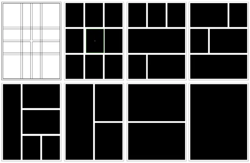
Panel size and aspect ratio carry storytelling weight independent of shape. Tall vertical panels emphasize height, confinement, or downward force. Wide horizontal panels suggest landscape, freedom, or the passage of time. Splash pages—single panels filling an entire page—create moments of awe, isolation, or dramatic revelation.
I start every project by defining a consistent panel arrangement—a grid that provides structure and coherence. But I don’t feel bound by it. Strategic breaks from the established pattern create emphasis precisely because the pattern exists.
How many panels fit on a page depends on what the scene demands. Comic strips typically use 3–4 panels. A standard comic book page averages 5–6. The famous 9-panel grid—Watchmen’s signature structure—creates a dense, controlled reading rhythm. Fewer panels mean bigger images and slower pacing; more panels compress time and accelerate it.

Shot Types Within Comic Panels
While panel structure deals with the frame, shot composition concerns what’s shown inside it. Comic artists function as both directors and cinematographers, choosing viewpoints that communicate specific information and emotions:
–Close-ups: Tight focus on faces or objects to highlight emotional states or important details.
–Medium shots: Characters from the waist up, balancing detail with context.
–Wide/establishing shots: Entire environments, orienting readers and establishing location.
As Rivkah LaFille’s analysis of camera conventions in graphic novels demonstrates, comics borrow many visual techniques from film—though the medium’s power lies in how panel structure and shot composition interact. Varying both prevents monotony and lets you emphasize key moments through visual choices rather than explicit narration.
The legendary comic artist Wally Wood created “22 Panels That Always Work”—a collection of shot compositions assembled by his assistant Larry Hama that has become an industry-standard reference for maintaining visual interest, particularly in dialogue-heavy scenes.
From My Studio
I drew my own versions of all 22 panels as a craft exercise and wrote a companion guide explaining when and why each composition works. It comes with my 15-page philosophical comic What Is Life All About?—a standalone work exploring the same questions as The Labyrinth. Get both free here.

Pro Tip: Tools for Designing Panels
Whether you work traditionally or digitally, a few tools are specifically useful for panel design. Rulers, T-squares, and triangles remain the foundation for precise panel borders on paper. In digital workflows, Clip Studio Paint includes dedicated panel frame tools that automate grid creation and gutter spacing, while vector software like Adobe Illustrator and Affinity Designer excels at creating clean, adjustable panel borders—Illustrator is my tool of choice for drawing panels and lettering my comics.
Panel Styles Across Comic Traditions
Different comic traditions have developed distinct visual styles in their approach to panels, each reflecting cultural influences and artistic philosophies.
Comic strips present the most constrained format—typically 3–4 uniform panels. Peanuts demonstrates how consistent, simple panels can deliver powerful narratives—Schulz’s four-panel structure became a vehicle for philosophical humor that rewards daily reading. But strips also produced radical innovations: George Herriman’s Krazy Kat used surreal, shifting backgrounds that redefined what a panel could contain, and Winsor McCay’s Little Nemo in Slumberland reshaped panels to match the dream logic of the story—stretching and collapsing frames as Nemo’s world transformed.
American superhero comics evolved from uniform panels to dynamic, varied shapes. Kirby’s innovations—diagonal borders, explosive splash panels, irregular shapes mirroring the energy of their content—turned the panel border itself into an expressive tool.
Franco-Belgian comics exemplify the ligne claire approach: clean, consistent rectangular panels with uniform borders. Growing up with Tintin, Spirou, and Blake and Mortimer shaped my approach to panels—keeping the frame mostly invisible so readers focus entirely on the content within.
Manga employs distinctive techniques—borderless panels for emotional expansion, speed lines breaking through panel edges, dramatic variation between tiny reaction panels and full-page splashes. Katsuhiro Ōtomo’s Akira pushed further still with meticulously detailed double-page spreads that set a new standard for visual density.
Webtoons—the fastest-growing comics format—replace page turns with continuous vertical scrolling. Vertical spacing between panels functions like gutters in print, controlling pacing through distance rather than framing. What webtoons sacrifice is the ability to connect panels spatially—seeing the whole page and individual panels at the same time, reading their relationships at a glance. What they gain is the power of revelation: each new panel appears on the screen through the scroll, creating more opportunities for surprises.
Panels in Non-Fiction and Philosophical Comics
Non-fiction and philosophical comics face a distinctive challenge: how to visualize ideas that have no natural visual form. Panels become more than narrative containers—they become conceptual frames that make abstract thought visible.
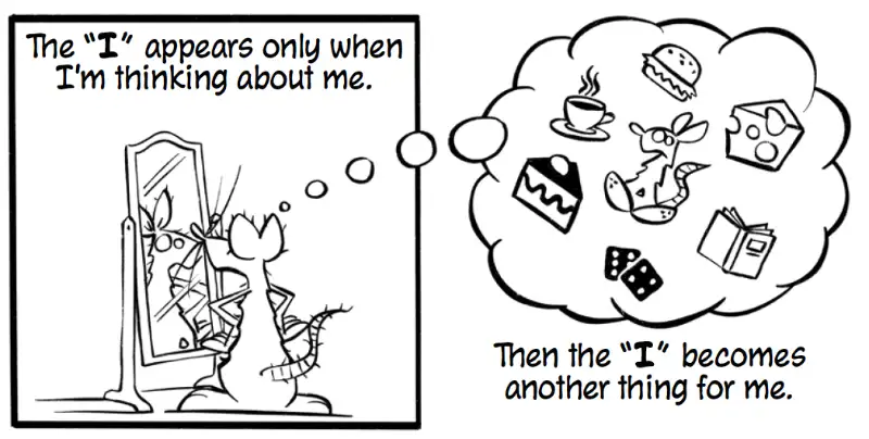
In The Labyrinth, I experimented with removing panel borders to amplify philosophical messages. When exploring the nature of the self, I used two contrasting panels: the first, a bordered square panel, shows the character seeing himself in a mirror — “The ‘I’ appears only when I’m thinking about me.” The second panel takes the shape of a thought bubble, showing the character as one object among many in his day-to-day world — “Then the ‘I’ becomes another thing for me.” The shift from rigid frame to thought-bubble frame is the philosophical argument made visual.
Common Comic Panel Design Mistakes and How to Avoid Them
Even experienced artists fall into panel design traps. Here are the most common—and how to fix them.
Overcrowding panels with excessive detail, dialogue, or action makes them difficult to read. The solution is ruthless editing—determine what’s essential and cut the rest. Comics excel at sequential storytelling; a single panel doesn’t need to carry everything.
Poor flow between panels causes reader confusion. This happens when arrangements create ambiguous reading paths or abrupt transitions. Clear visual hierarchies guide readers through your intended sequence.
Ignoring shot composition leads to visually monotonous pages. Mix close-ups with establishing shots, try different perspectives, and use Wood’s proven compositions when appropriate.
Inconsistent panel sizing without purpose creates visual chaos. While variation adds interest, random changes without narrative justification appear amateurish. Develop systems: larger panels for significant moments, smaller for quick sequences.
Inconsistent border styles without purpose has the same effect. Build a consistent code—jagged for violence, rounded for memories, solid for normalcy—and maintain it throughout your story.
Random shot progression undermines narrative clarity. A bullet-proof technique is to begin every scene or location change with an establishing shot that orients readers spatially, then to progress logically from wide to close as action intensifies. Reserve extreme close-ups for moments of genuine emotional weight. These aren’t rigid rules—but breaking them should be a conscious choice.

Conclusion
Mastering panels means understanding that the frame is never neutral. Every choice about size, shape, border, and sequence carries meaning—whether you intend it or not. The craft lies in making those choices deliberately so that structure and story reinforce each other on every page.
Further Resources
For deeper exploration of panel design and visual storytelling theory:
–Scott McCloud’s Understanding Comics—Essential theory for every comics creator and serious reader
–Scott McCloud’s Making Comics—Storytelling secrets of comics, manga and graphic novels
–Will Eisner’s Comics and Sequential Art—Foundational principles from comics’ greatest theorist
–Marcos Mateu-Mestre’s Framed Ink 1 & 2—Comprehensive instruction on visual composition and framing for sequential storytelling
Frequently Asked Questions About Panels in Comics
What is a panel in a comic book?
A panel is an individual frame containing a single moment or scene—the basic unit of comics storytelling. Panels work in sequence to create narrative, with their size, shape, and arrangement controlling how readers experience time, pacing, and emotion.
What are the different types of comic panels?
The main types are regular (standard rectangular), irregular (non-standard shapes for emotional effect), overlapping (intersecting frames suggesting compressed time), borderless (extending to the page edge for expansiveness), and inset (smaller panels within larger ones for detail or reaction).
How many panels should a comic page have?
It depends on pacing. Comic strips use 3–4, a standard comic book page averages 5–6, and dense formats like Watchmen‘s 9-panel grid create a compressed, controlled rhythm. Fewer panels mean bigger images and slower pacing; more panels accelerate it.
What is the space between comic panels called?
The space between panels is called the gutter. Gutters are where the reader’s imagination fills in what happens between frames—a process Scott McCloud calls “closure.” Gutter width also affects pacing: wider gutters suggest longer pauses between moments.
Originally published 5 June 2025 | Last updated 1 June 2026
By Ben Argon, philosophy comics creator and author of the Eisner-nominated graphic novel The Labyrinth, exploring the intersection of comics, philosophy, and visual storytelling.